404: Not Found, But Make It Fashion — The Rise of Deliberately Broken Web Design
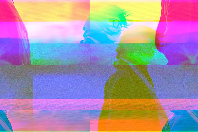
Let's be honest: you've landed on a website that looked like it was mid-seizure and immediately hit the back button. Pixelated text crawling sideways across the screen. A navigation menu that leads nowhere. Images that render as horizontal slices of color, like someone fed a JPEG through a pasta maker. Your instinct was probably to check your Wi-Fi.
But what if that chaos was the product?
Welcome to the aesthetics of digital decay — a growing, deliberately weird corner of internet culture where broken is beautiful, obfuscated is intentional, and your confusion is not a bug. It is, emphatically, the feature.
Static Has Always Been Trying to Tell Us Something
Before we get too precious about this, let's acknowledge that humans have been romanticizing broken signals for decades. Old-school radio static. VHS tapes that degraded into abstract impressionism after too many rewinds. The particular way a scratched DVD would freeze mid-scene and pixelate an actor's face into something vaguely Cubist. There's something deeply resonant about a medium failing to communicate cleanly — it reminds us that the signal was always fragile, always passing through something messy to reach us.
The internet, for most of its commercial life, has tried to suppress that fragility. Smooth gradients. Clean sans-serif fonts. Rounded corners on everything. The entire UX industry exists to sand down the rough edges of digital experience until it feels like touching warm glass. Frictionless. Invisible. Efficient.
Glitch artists, error-embrace designers, and what some corners of Tumblr are now calling "corrupted web" creators are pushing back hard against that smoothness. They want you to feel the grain.
Vaporwave Had a Baby With a Server Crash
To understand where this movement comes from, you have to spend a little time with vaporwave — that early 2010s aesthetic that took the glossy, optimistic corporate imagery of the 1980s and 90s and ran it through a blender of irony, nostalgia, and lo-fi melancholy. Pastel sunsets. Roman busts. Slowed-down smooth jazz. The aesthetic basically asked: what if capitalism's promises looked beautiful and sad at the same time?
Glitch web design is vaporwave's more aggressively nihilistic cousin. Where vaporwave was melancholy, glitch art is confrontational. It doesn't just mourn the promises of the digital age — it actively scrambles them. Text overlaps until it's unreadable. Color channels separate. Layouts collapse. The experience of navigating these sites feels less like browsing and more like archaeology through a digital ruin.
Cyberpunk aesthetics feed into this too, particularly the genre's long tradition of imagining technology as something lived-in, scarred, and jury-rigged. In cyberpunk cities, neon signs are always half-burned out. Screens flicker. Hardware is duct-taped together. The glitch web movement borrows that visual vocabulary and applies it to the browser window, turning your laptop screen into a rain-soaked alley in some near-future city where the servers never quite work right.
Which, honestly, describes a lot of actual internet infrastructure if we're being real.
The Artists Who Want You to Get Lost
Creators working in this space tend to share a particular philosophy: navigation is a power relationship, and deliberately breaking it is a statement. When a website is easy to use, it's in control. When it's impossible to use, you have to bring something to the experience — patience, interpretation, a willingness to sit with confusion.
Some designers are building sites with intentionally circular link structures, where clicking "Home" takes you somewhere that is definitely not home. Others are using CSS in ways that would make any UX professional physically ill — overlapping elements, text that runs off the edge of the viewport, color contrasts that technically render but require genuine effort to read. One increasingly popular technique involves deliberately corrupting image files just enough that they display as something strange and abstract rather than simply failing to load.
There's also a community of creators who work specifically with real error states — 404 pages built out to feel like entire worlds, server timeout messages that unfold into narratives, maintenance mode screens that are more evocative than most gallery installations. The 404 page, long treated as an embarrassing necessity, has become a canvas.
This publication — and we say this with full awareness of our own deeply ambiguous corner of the internet — has a certain sympathy for this approach. When your domain name looks like someone sat on a keyboard, you develop a relationship with the aesthetics of the unclear.
Is It Commentary, or Is It Just Annoying?
Here's the tension that glitch web design hasn't fully resolved: there is a meaningful difference between a broken experience that rewards patience and one that simply wastes your time. The best work in this space is legible as intentional — you can feel the craft underneath the chaos, the deliberate choices that distinguish artistic disorder from a site that just hasn't been maintained since 2009.
The worst of it is indistinguishable from genuine neglect, and that's a problem. When everything looks broken on purpose, actually broken things get a free pass. Critics of the movement — and there are plenty, mostly in UX and accessibility communities — point out that deliberately inaccessible design is still inaccessible design, regardless of the artistic intent behind it. Screen readers don't care about your commentary on digital fragmentation.
It's a fair critique. The most thoughtful creators in this space tend to acknowledge it, building their chaos in ways that remain navigable for users with disabilities even while they're deliberately frustrating for everyone else. That's a harder needle to thread than it sounds.
The Internet Was Always Kind of Haunted
Maybe the deepest thing glitch web aesthetics are doing is making visible something that was always true: the internet is a weird, unstable, deeply impermanent place. Websites disappear. Links rot. Platforms that hosted entire communities evaporate overnight. The Wayback Machine exists specifically because the default state of online content is erasure.
When a designer makes a site that looks like it's in the process of disappearing — corrupted, fragmented, half-loaded — they're not being nihilistic. They're being honest. The polished, permanent-feeling web was always a performance. The static was always underneath.
Somewhere in the signal noise, something is trying to come through. We're not always sure what it is. But at StaticNoise, we've made a kind of peace with that uncertainty — which is maybe why this particular art movement feels, to us, a little bit like home.
Or at least like a 404 page we've learned to sit with.
Entertainment from the void. Signal unclear. Thanks for tuning in.